
Win32 Relics vs WinUI 3 Screens: A Side-by-Side Verdict on Microsoft's Windows 11 Interface Clean-Up
The answer most readers need first is a practical one: yes, the two Windows eras living on the same desktop are finally being reconciled, but they are being swapped out one dialog at a time, and only a few of the replacements are already usable. Press Win+R or open the properties page of a deleted file today and you can see the new look; open the storage maintenance utility in the Start menu and you still get a window whose design language feels older than many of the machines running it. This is where Microsoft's interface standardisation project stands as of late 2026, what each rebuilt screen actually buys you, and which toggles are worth flipping now versus waiting on.
Over the past few years, visual consistency has been the recurring complaint about Windows 11: a modern Settings app sits beside Win32 windows left over from decades ago, and the File Explorer properties window, the Run dialog and assorted Control Panel modules keep surfacing that mismatch in ordinary use. The news now is that the cleanup has reached a component nobody expected to be prioritised.
The newest target: a storage tool that predates most users' habits
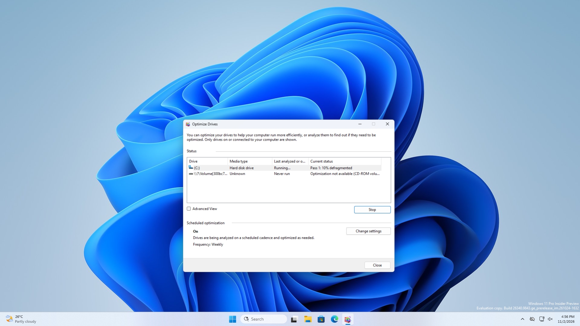
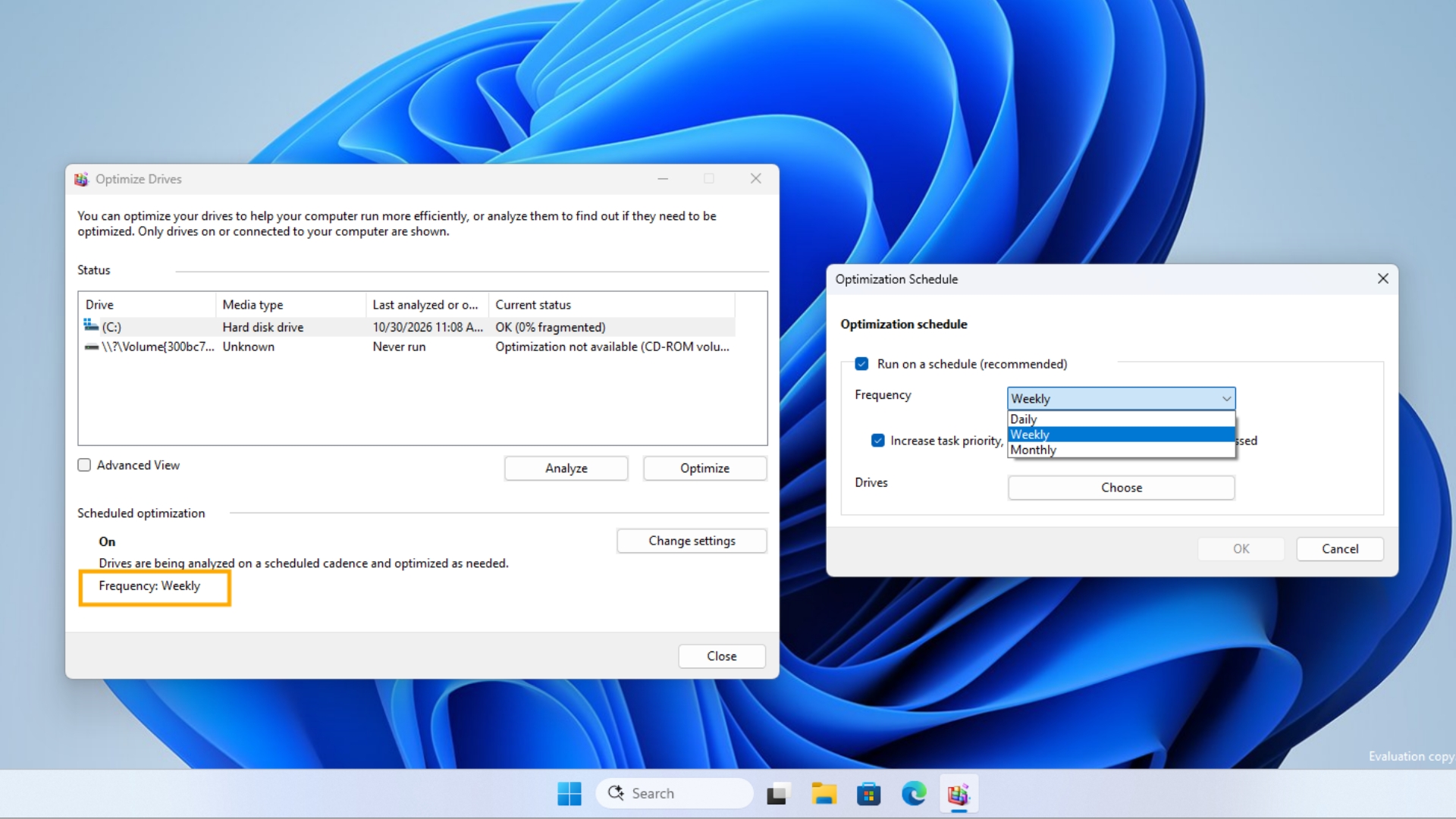
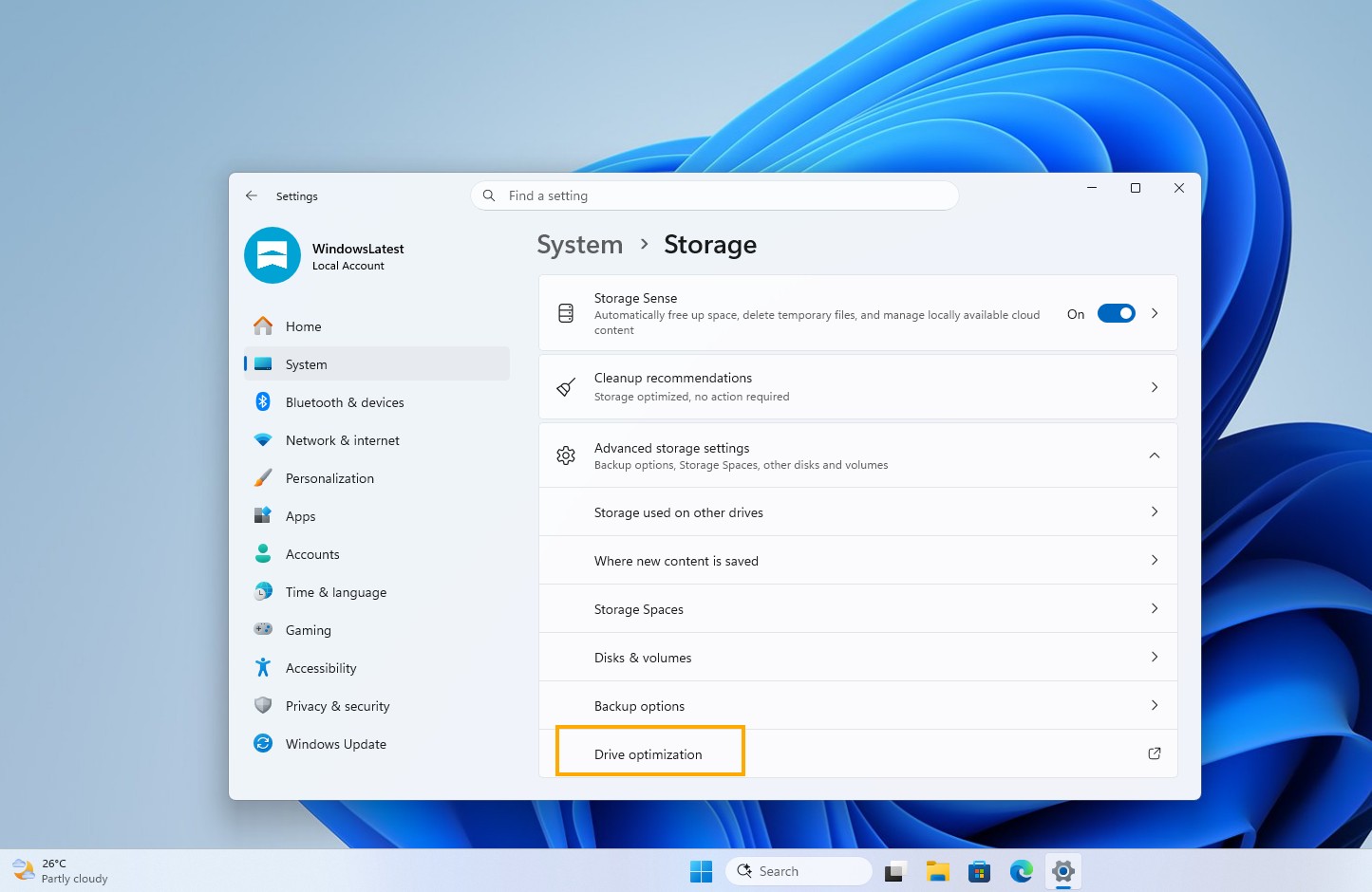
Windows Disk Defragmenter — the utility the Start menu labels as drive optimisation — has joined the modernisation backlog. According to hands-on coverage carried by Sina Tech and Chinese outlet Kuai Technology, the tool's visual style has barely moved since the Windows 8 era, and for many people the window still looks like it belongs to Windows Vista or earlier, which is why its inclusion carries symbolic weight far beyond its function.
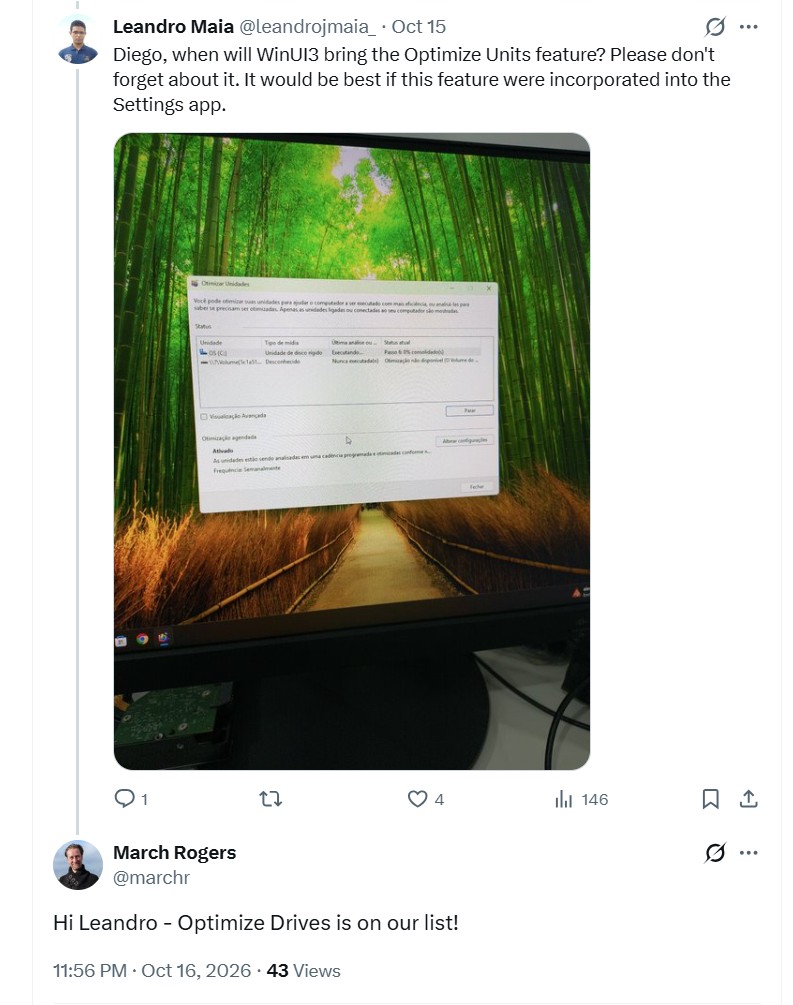
The sequence is unusually public. Windows design vice-president Diego Baca shared UI progress on social media on October 15, 2026; a user then proposed rebuilding the drive-optimisation window in WinUI 3 or folding it into the Settings app; the next day Microsoft design lead March Rogers answered that the disk defragmentation tool is already on the team's update list. What Rogers did not supply is a date. Microsoft has been visibly cautious while migrating legacy Control Panel items such as network and printer settings, so a realistic expectation is months of internal testing rather than a next-month rollout, and it remains unclear whether the tool survives as a standalone app or disappears into Settings, or whether it will ship through the Microsoft Store or ride an annual feature update.
One clarification matters before anyone upgrades expectations: this is an interface and architecture rebuild, not a new maintenance engine. The tool still does hardware-aware work — rearranging fragmented file clusters on a mechanical drive so the read head seeks less, and issuing TRIM commands to a solid-state drive so the flash chips know which blocks are no longer in use and can reclaim them while idle. A fresh WinUI 3 coat changes how readable that status list is, not how the disk is treated.
Scorecard: legacy screen, WinUI 3 replacement, and whether to switch today
| Component | What you use today | What the rebuild changes | Status | Switch now? |
|---|---|---|---|---|
| Run dialog (Win+R) | Win32 dialog dating back to the mid-1990s | Rewritten as a C#/WinUI 3 app compiled with .NET AOT; Microsoft's Windows Command Line blog reports a median time-to-show of 94 ms versus 103 ms for the version it replaces | Optional toggle in Settings > System > Advanced | Yes — it is reversible and measurably faster |
| File Explorer properties window | Tabbed legacy dialog with no true dark mode | Rebuilt from the ground up rather than re-skinned; early WinUI version adds dark mode and a single General view listing name, type, origin, size, dates and a restore action | Spotted in Experimental Preview build 26300.8935, deleted files only (XDA Developers) | Wait — coverage is narrow for now |
| Disk defragmentation tool | Drive list plus optimise button, unchanged since Windows 8 | WinUI 3 redesign confirmed as planned; function stays the same | On the update list, no schedule | Nothing to do yet |
| File copy and common file dialogs | Progress bar and open/save pickers from an older Windows generation | Named by March Rogers as part of a systematic rewrite of all older dialogs; the copy dialog is reportedly finished internally, with the common file dialog queued behind it | In progress | Nothing to do yet |
| Start menu and Control Panel modules | Mixed native and legacy surfaces | Multiple system interfaces are moving to WinUI architecture; legacy Control Panel items migrate slowly | Partially migrated | Just expect gradual change |
Read across that table and the pattern is clear: the finished items are the ones you interact with dozens of times a day and where a few milliseconds and a consistent theme are noticeable, while the entries with no date attached are precisely the ones that used to be buried in submenus. That ordering is a deliberate triage, not an accident.
Why the framework matters more than the rounded corners
Microsoft positions WinUI as the native user interface framework for the future of Windows. The pitch is not that desktop applications should become lighter at the cost of speed; the aim is to keep desktop performance while adding a unified Fluent Design experience — rounded window corners, animation, Acrylic and Mica materials, dark mode and modern controls. Against the Win32 screens still scattered through the operating system, WinUI offers stronger hardware acceleration and a far more consistent look. That is also how the Windows Insider team framed its quality commitments in March 2026, describing reduced interaction latency as a reason to move core Windows experiences onto the WinUI 3 framework.
The corporate context is what makes this more than another skin. Over the past several years Microsoft cycled through options: from Win32 to WPF, then to UWP, then to web-based approaches — a chain of switches that left developers wary of committing. Quite a few first-party apps leaned on WebView2 for interface work, which effectively embedded browser technology inside the operating system. That route did raise development velocity, yet it came with performance overhead and consistency costs; users routinely reported that some Windows components start slowly, consume more memory and feel less fluid than native desktop software. In recent years the company has reverted to a native-first posture and installed WinUI as the core technical direction for Windows.
During this year's Build 2026 developer conference, Microsoft again promised developers that WinUI would be the preferred framework for modern Windows application development, and Build 2026 also confirmed that the main WinUI development work would move fully to GitHub, where progress is visible in real time and feedback can be filed directly. Trade publication Thurrott reported the completion of that move in August 2026, which is a useful signal: a framework whose roadmap, issues and releases are public is harder to abandon quietly, and that helps answer the doubts left over from the UWP era. For comparison, Microsoft's own Windows developer FAQ on learn.microsoft.com stresses that WinUI 3 grew out of the WinUI codebase for UWP but that the two are distinct technologies — a distinction that keeps tripping up teams evaluating a migration.
Picking a framework in 2026: four realistic scenarios
- New Windows-only desktop product. WinUI 3 on the Windows App SDK is the strongest forward-looking base, since it is now the framework Microsoft keeps for system-level work.
- Long-lived enterprise tool with dense grids and printing. WPF remains defensible: mature control ecosystems and predictable behaviour still outweigh visual alignment with Windows 11.
- Existing UWP application. Treat WinUI 3 as the migration path, not as a rebranded UWP; packaging and deployment models differ enough to require real rework.
- Web-first internal tool that must feel local. WebView2 still delivers speed of delivery, but accept the memory footprint users already complain about.
Trade-offs the announcement leaves out
Modernisation is not universally welcomed inside the Insider community. Discussion threads on Microsoft's own Tech Community have criticised the new Run dialog for looking bulkier than the compact legacy box it replaces, and early hands-on reports noted that the window could not yet be dragged or repositioned — small ergonomics regressions that matter to keyboard-first users. There is also scepticism about WinUI's runtime cost and stability on lower-end hardware, which is exactly the segment where a 9 ms improvement in dialog latency is least likely to change daily satisfaction. Finally, none of this guarantees a finished system: Microsoft's stated method is to keep reworking legacy components and replace them with new native interfaces rather than merely adding a visual wrapper over old code, and that work has no published end date.
Common misconceptions to drop
- "Dark mode means the screen has been modernised." The File Explorer properties window confirms the opposite standard: the verification from Rogers was that it was rebuilt in WinUI 3 from the ground up, not re-themed.
- "Turning on the new Run dialog deletes the old one." In this early stage it is opt-in, and the legacy dialog stays available so you can switch back.
- "The disk defragmentation tool is getting smarter." It is being redrawn; defrag on spinning drives and TRIM on solid-state drives stay exactly as they are.
- "WinUI 3 is UWP with a new label." Microsoft's developer documentation says they are distinct technologies despite shared origins.
- "Everything legacy lands in this Windows release." With no schedule for the storage tool and cautious Control Panel migrations as precedent, plan in quarters, not weeks.
Checklist: what to do, in order
- Update to a Windows Insider Experimental Preview build if you want to see the new properties layout before general release.
- Open Settings > System > Advanced, enable the Run Dialog toggle, then press Win+R to compare both versions yourself.
- Test the new dialog inside your real workflow — scripted launches, remote sessions, accessibility tools — before recommending it across a fleet.
- If you maintain an enterprise desktop image, disable or defer the change until complaints about window size and positioning are addressed.
- If you are a .NET developer, watch the WinUI repository on GitHub instead of waiting for marketing summaries of what comes next.
- Run your drive maintenance on the existing utility: it still does the job regardless of how the window looks.
Frequently asked questions
Is the new Run dialog safe to enable?
It is reversible through the same Advanced settings switch, and Microsoft's published numbers show it opens faster than the legacy version. The realistic cost is layout preference, not stability.
Why start with dialogs users touch constantly?
That is exactly the triage logic: copy progress, properties pages and the Run box are the highest-frequency legacy surfaces. Adding the disk defragmentation tool afterwards shows the backlog is worked by visibility, not by age alone.
Will this make my PC faster?
Expect consistency and responsiveness at the window level — hardware-accelerated rendering and lower interaction latency — not higher throughput from your applications or storage.
Is there any date I can plan around?
No official schedule exists for the drive-optimisation redesign. Treat a general-availability interface as evidence the rewrite pipeline works, and treat the rest as unannounced.
Bottom line for three kinds of readers
Everyday users gain a tidier, quicker-feeling desktop in small increments; the sensible move is to opt in where the option exists and change nothing else. IT teams should treat each rebuilt dialog as a testable variable rather than a cosmetic default, because size, positioning and muscle memory all generate tickets. Developers get the clearest signal yet that WinUI is where Microsoft intends to stay, reinforced by the public GitHub development model.
Analysts read the same news differently from end users: adding an ancient disk defragmentation tool to a modernisation list suggests the objective is not a handful of refreshed screens but a coherent, faster and more consistent system experience aligned with how Windows 11 is supposed to look. If the programme holds, the jumble of old and new windows that defines the platform today should thin out year by year, and WinUI has a credible path to becoming the most consequential desktop framework for Windows since Win32.